Leave your information here
Skip to product information
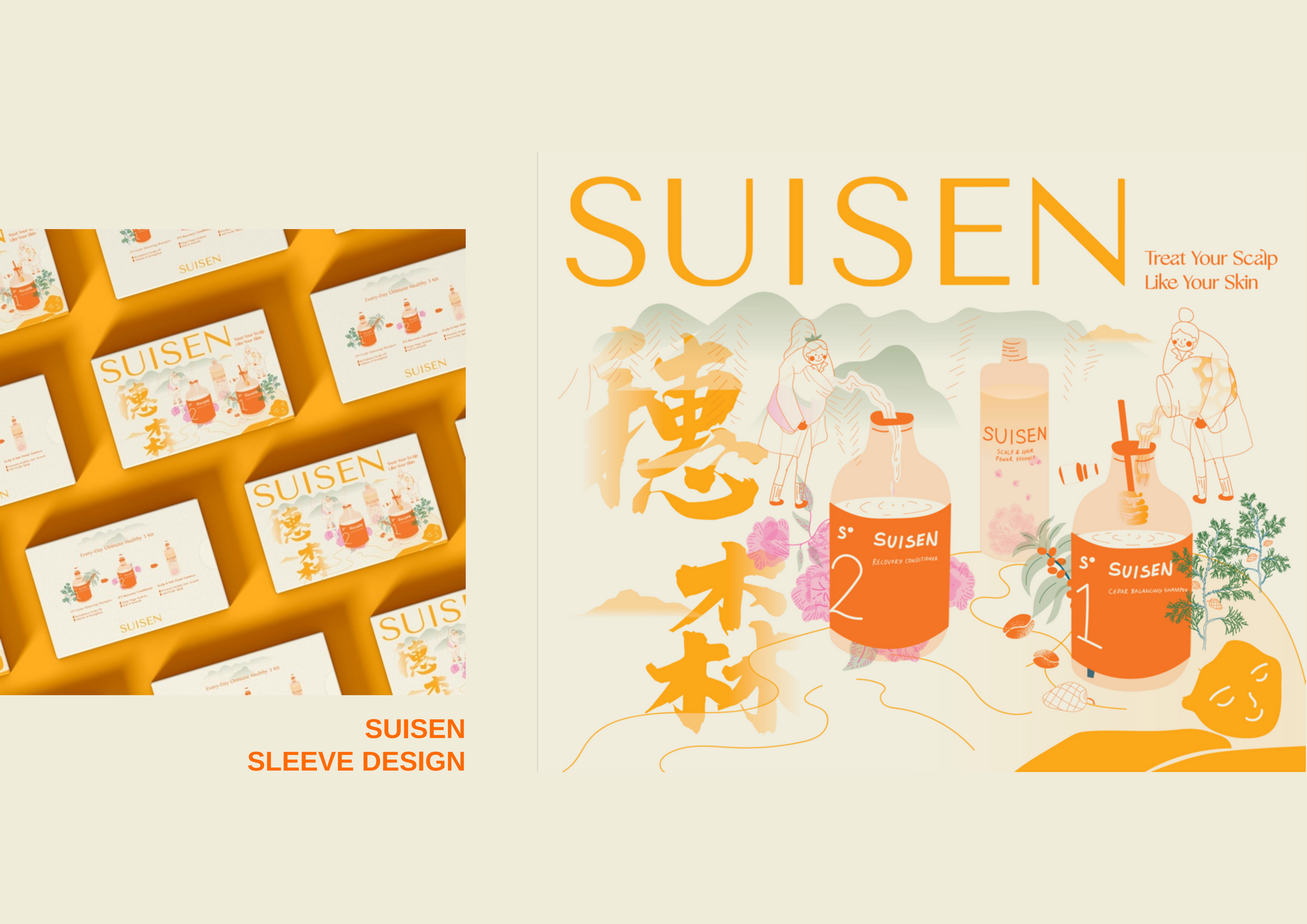

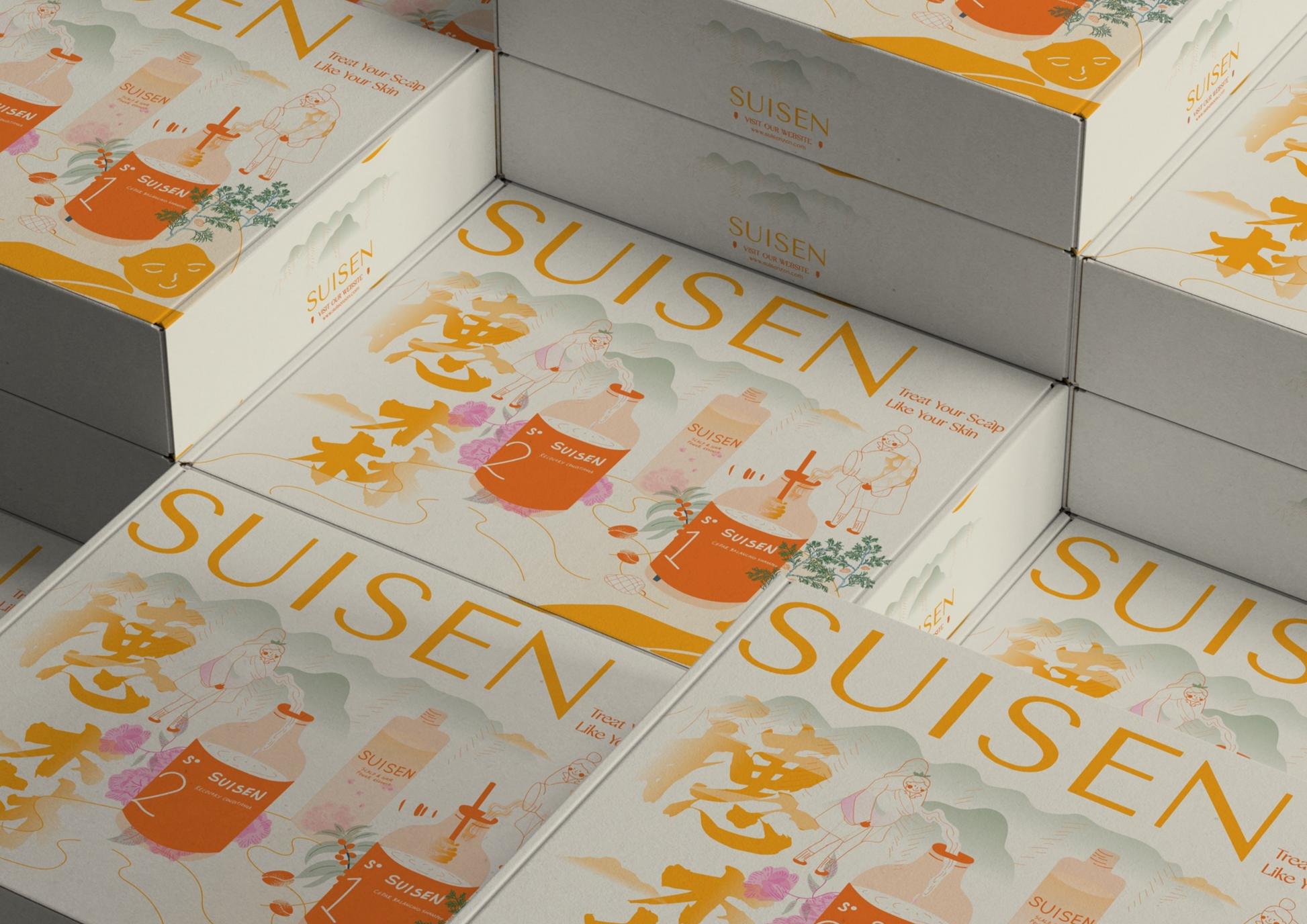
Pure choice: SUISEN skincare-grade scalp care brand
We created a complete visual identity and packaging system for the high-end scalp care brand SUISEN. Centered around the core insight of "caring for your scalp like you care for your skin," we blended the purity of laboratory aesthetics with the sophistication of high-end skincare to create a trusted visual language, establishing SUISEN as an authority in scalp health.
Drawing inspiration from the Japanese aesthetics of "silence" and "white space," we used extreme restraint, exquisite material textures, and iconic typography to shape the name "SUISEN" into a core visual symbol, conveying extraordinary brand confidence and pure quality in a quiet way.
Designing for SUISEN is a profound practice of the concept of "less is more." In a world that encourages noise, we choose silence to speak. True luxury lies in the courage to leave no space, in the ultimate focus on materials and craftsmanship. We are honored to work with SUISEN to define this contemporary Eastern elegance.
In our commitment to the client, we only present the design here and do not disclose the project details. This design was created by the LUMYOND designer. If there is any infringement, we will hold accountable immediately.
Pickup currently not available